navigation | 2016-03-23

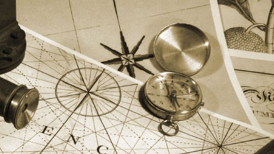

if you happen to have a map of the area, you’re a step ahead. but, even then, you’ll need to add a bunch of information for the map to be helpful. you need to know your coordinates (more or less) on the map, the coordinates of your destination, and you need to decide on your route — do you want to see all the sites along the way or get there as quickly as possible? in our inner city example, your options are usually pretty limited — you can take the roads, the walkways, or the alleys and that’s about it; you can’t drive through the buildings, for example.
if you leave the city or the forest and hit the water, things change quite a bit. not only are there no roads to proscribe our routes, the map itself becomes a mind-bending projection of reality. in the city, a two-dimensional map can fairly accurately represent the grid-like layout of the streets/alleys/etc. but on the water, especially if we get to an oceanic scale, you’re looking at a flat representation of the surface of a round object. this means that what you are seeing does not accurately represent the actual size/distance/shape of the thing you’re actually on (that is, earth).

take a quick look at the mercator projection of earth, perhaps the most commonly used ‘map’ of earth. you may notice that the distance between the lines of latitude (the horizontal ones) increases as you move away from the equator. thus, antarctica and greenland look totally enormous — you could easily fit the entire landmass of the western hemisphere into antarctica on that map. in reality, antartica is roughly twice as big as australia. also, in reality, india is about three times the size of scandinavia. so, why would mercator create such a distorted picture of the planet? for navigation, that’s why.
the mercator projection, while it changes the relative size of objects, still accurately maintains the shape of objects because it is a conformal system (math… ouch…).

the benefit of this system is that the latitudinal and longitudinal lines are all straight and, if you’re plotting a course of constant bearing, you can draw straight lines on the map which will translate, more or less, back into reality with some real accuracy.
so, given all this, there are three different lines you can draw between any two points on earth and, thus, navigate along them. and they are: great circles, rhumb lines, and isoazimuth.

great circles are lines that make complete circles, the centers of which are at the center of the earth. so, on mercator’s projection, great circles end up waving up and down like sine waves. to travel on a great circle, you need to constantly change your heading, due to the curve of the earth, but you actually wouldn’t have to turn your steering wheel since the line is straight.

rhumb lines are slightly different. to follow a rhumb line, you need to set your bearing at a constant, related to magnetic north. thus, your course, if you continue it all the way around the earth, will pass through all the meridians of longitude and do so at the same angle. so, you end up with a line that spirals around the sphere of the earth. thus, your heading remains the same at all times (always at whichever angle to magnetic north) but you would have to constantly adjust your steering on a turn, making it tighter and tighter as you get closer to the poles.
so, if you don’t want to constantly change your heading, you need to follow a rhumb line, which is fine over short distances, especially if you are headed more east-west than north-south. if, however, you are travelling a long way, it turns out that rhumb lines, especially at steeper angles (more north-south), end up being longer than great circles would be between the same two points.

isoazimuth is a much more wiggly line and can be described as:
the locus of the points on the Earth’s surface whose initial orthodromic course with respect to a fixed point is constant.”
obviously…
i can’t even really wrap my brain around the concept of isoazimuth lines or their use but, apparently, they are the third kind of navigational line you can draw. they also create, conversely, a completely different projection, like this:

alright… there’s too much math to talk about now… i’m out…
so far on navigation
_____
because it’s amazing, i’m adding some pictures comparing the actual size of things on the planet.
 |
| major world islands |
 |
| world map | proportional population |
 |
| world map | proportional landmass |
And a link to a bunch of others:
Whee!


